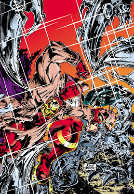
When seeking brutal violence to assuage the cruel heart of Bahlactus, Jaime Hernandez’s Locas, that insightful series about young punks from the barrio growing into unfulfilled middle age, may not be the first place you’d look.
But Jaime Hernandez can draw anything with clarity, verve and life. And in the early days, anything was just what he did draw – spaceships, dinosaurs, superheroes, horn-headed billionaires … and a women’s wrestling champion getting embroiled in a murder in a fictitious South American country, and running into an old and brutal rival from the ring.
Ladies, gentlemen and Devourers of Worlds, we present Queen Rena Titañon versus Bull Marie!
I love the framing of the two tiers that show the actual fight: the regular panel grid, and unwavering but not all-encompassing point of view give the action a steady rythmn but also a slightly chaotic vitality (are we going to lose sight of Rena entirely?) that complements the power that Hernandez's draughtsmanship puts into each blow; and then the wide, static panel opening the final tier is an exhilation of relief and triumph.
Panels
“Toyo’s Request” by Jaime Hernandez, Love and Rockets issue 3, Fantagraphics, Fall 1983
An ageing Englishman rambles on about comics and other unpopular aspects of popular culture
Friday, 31 August 2007
Thursday, 30 August 2007
Review: Lucky
Lucky volume 2 issue 1, “My Slideshow” and “My Affliction” by Gabrielle Bell, 32 pages of strip, Drawn & Quarterly, May 2007, CDN$4.25
In this issue of Lucky, Bell presents two inter-linked stories. The second, slightly longer, tale “My Affliction”, is a dream-like narrative of giants, dogs and sudden emotional attachments. The first, shorter, story is a directly autobiographical piece in which Bell presents “My Affliction” as a slideshow and attends a comics convention in the United States.
The two stories share a common presentation. Each uses a regular and invariable six-panel grid. Almost all panels show full-length figures in medium shot. The exceptions can be seen as reinforcing this rule. For example, in one panel, we see a close-up of a hand holding a wooden doll, but the doll itself therefore takes the place of a full figure, foreshadowing its later transformation into a person. Throughout, Bell draws with a largely unmodulated, even line, adding shading and weight with hesitant patches of black.
The effect of these techniques is that both stories proceed at a steady, even monotone, like a passage of prose made up of sentences of similar length, all beginning, “And then…”. But this has different effects in the two halves. In “My Affliction”, it makes the bizarre events and transformations seem mundane and plausible, while in “My Slideshow”, the unnatural regularity creates a sense of unease and tension. Thematically, the two stories also seem to take complementary tacks: “My Slideshow” is predominantly about Bell’s internal state and insecurities, while “My Affliction” externalises her emotions onto her relationships with the dream characters she meets.
The result conveys to me more mood than meaning, but that’s no bad thing. Normally, I find little interest in accounts of a cartoonist’s day to day life, and less in the recounting of dreams, but by linking the two, without drawing blatant parallels, Bell has produced something much more engaging.
Wednesday, 29 August 2007
Review: Superman 666
Superman issue 666, “The Beast from Krypton” by Kurt Busiek (writer), Walter Simonson (artist), John Workman (letters), Sinclair and Loughridge (colours) and Matt Idelson (editor), 38 pages of strip, US$3.99, DC Comics, October 2007
It’s a dream! It’s a hoax! It’s not an imaginary story! (Except that, you know, aren’t they all?)
The last demon from Krypton’s Hell – destroyed along with the planet and its inhabitants – arrives on Earth and tries to corrupt Superman as he dreams, gaining strength from Superman’s descent.
I’m tempted to quibble with the universality of American Christian concepts in DC’s cosmology: a hell with demons tormenting sinners is not even a part of all of Earth’s religions, let alone a necessary component of those of other planets; and the idea that Superman has only to sin in his heart for it to be real is oddly reminiscent of Jimmy Carter. But that would be unfair. After all, this story owes its very existence to the fact that its issue number matches a cryptic crossword clue in the Book of Revelations.
And the story is, mostly, a lot of fun, with an increasingly surly and sulky Superman (amusingly cartooned by Simonson) dealing unrestrainedly with the frustrations of his life: all those people demanding protection, Jimmy Olsen and his screeching signal-watch, the parade of pointlessly aggressive super-villains. In doing so, he produces an array of ever-sillier silver-age super-powers.
(Hmm. I’ve never been able to dictate the rules in my dreams. But then again I’m not Superman, so we’ll let it ride.)
Eventually, of course, the real, pure-hearted Superman reasserts himself in a manner that recalls the best bit of the movie Superman III.
Busiek paces the story nicely, with an ominous build-up and a nicely graduated slide into corruption, and keeps a decent handle on exposition by the device of having Zatanna trying to work out what is happening. The story can be taken as a counterpoint to his ongoing “Camelot Falls” arc, in which Superman is confronted with the possibility that his selfless heroism is holding back humanity’s development. Here, in contrast, we see the consequences if he gives in to selfishness. There are oddities – I’m not sure why Hawkman, Animal Man and Aquaman should make portentous announcements to thin air as the demon passes, and I was strangely distracted by the fact that Clark Kent is still using a manual typewriter in 2007 – but the only part of the story that really failed for me is that it goes out of its way to raise the question of whether, in the current version of the continuity, Superman has killed (as he did in John Byrne’s 1980s run on the title). Really, is there anyone who regards this sort of guessing game as entertaining? It’s not as if we can engage with it: we can merely await an arbitrary decision by DC editorial.
Wholly on the positive side of this issue is Simonson’s artwork. It’s not strikingly developed from the mature style he was already using by the time of his work on Thor or New Gods (except, perhaps, by adopting a touch of Ted McKeever for the demonically-possessed versions of Batman, Wonder Woman and Supergirl), but it’s good to see it again. Simonson seems to have been devoting more time to his writing lately: it would be nice if he got his pencils out more often, as in many ways, he is an ideal superhero artist.
Simonson’s artwork reconciles a number of apparently opposing traits. It is monumental, but massively energetic. It is loose, but makes extensive use of rigidly geometric shapes, circles and straight lines. It is sculptural, but flat – an impression reinforced by John Workman’s lettering, which never leaves the two-dimensional picture plane. The result is like some mad Assyrian bas-relief, only livelier, more colourful, and a good deal less vile.
Overall, an entertaining one-off issue. On this evidence, stepping aside from long arcs and crossovers can clearly make for good storytelling.
Tuesday, 28 August 2007
The Magical Cleavage Window – It’s All Done With Mirrors
Over at Journalista!, Dirk Deppey has posted Darwyn Cooke’s cover for the next issue of The Comics Journal. “What do you see?” he asks.
Well, I see someone who can’t hold a mirror properly. It’s got a handle, young lady. I hope those gauntlets are clean, otherwise you’ll be leaving smeary marks all over the surface.
And, anyway, I thought it was the eyes that were the mirror of the soul?
(Technical note: the specialist vestmental-panelological term “Magical Cleavage Window” was coined and defined by Mr Dave Campbell. All serious scholars of sequential art are in his debt.)
A Straw
I see that one of the papers being delivered at the Manchester Metropolitan University conference “The Aesthetics of Trash: Reassessing Animation and the Comic” today and tomorrow is “The European Graphic Novel from Töpffer to Today” by Paul Gravett.
Is it too much to hope that this might be the start of a volume on bandes dessinées, to match his books on Manga and Great British Comics?
The full list of papers is at BugPowder (which has no permalinks, so scroll down to 22 August).
Is it too much to hope that this might be the start of a volume on bandes dessinées, to match his books on Manga and Great British Comics?
The full list of papers is at BugPowder (which has no permalinks, so scroll down to 22 August).
Ninety Years On
Today would have been Jack Kirby’s 90th birthday.
To mark the occasion, here’s Kirby’s reinterpretation of probably the first recurring comics character*, Ally Sloper, drawn in 1976 for comics historian Denis Gifford, and scanned here from The Jack Kirby Collector issue 12, July 1996.
*Update, 30 September: I no longer believe this. See here for why.
Monday, 27 August 2007
Keith Robson’s History of Comics
I took advantage of the Bank Holiday weekend to take a short trip to see the free exhibition Keith Robson – The History of Comics at the Museum of Hartlepool.
Keith Robson is a Hartlepool-born comics artist, chiefly for DC Thomson, and an illustrator for TV and books. The exhibition is partly about his work and partly about British comics generally, drawing on Robson’s personal collection. Despite the unrestricted title, there is no consideration of comics from other countries.
The problem with a museum exhibition about comics is that there is no way of treating the subjects in the way their producers intended – you can’t be allowed to leaf through and read them, for fear of damage. This exhibition approached the problem in four ways. On the walls were examples of Robson’s original art for strips like “General Jumbo” (from The Beano) and “Tricky Dicky Doyle” and “Jonah” (from The Dandy). In display cases were, I’d guess, something over a hundred comics, mostly from the 1950s to the 1980s, but with a good number of earlier examples too. All of these were closed, which meant that you could only see the covers. Fortunately, a lot of British comics used to run actual strips on the cover, not just single images, so there were samples of different styles of comic to read and consider. There was a television display cycling through a slideshow of comics images. And, earlier in the exhibition’s run, Robson had worked with a number of local children to produce a new strip with and about them. The results are now on display in a cabinet.
Context for these exhibits was a little lacking. There was no soundtrack to the slideshow, so the images were unexplained. There were two pages of text on display stands – one a biography of Keith Robson, the other his potted history of British comics, which sets out his view that comics effectively started in 1937 with The Dandy and that “traditional British comics” have now died out except for The Beano. The question of whether the mixed magazines now produced for children should be classed as “comics” is one that gets people hot under the collar, but what was odd in this case was that Robson’s exhibition did not match his definition. There were several pre-1937 comics on display, as well as issues of Starblazer picture library (if libraries are part of Robson’s “tradition”, then Commando is another survivor).
If anything, it was the pre-1937 comics that were of most interest to me. Regular periodical comics have been around in Britain since the 1880s. The significance of The Dandy is that it did away with the older British custom of telling comics stories twice over – once in pictures and word balloons, and again in text captions under each frame. This was a very useful way of producing nursery comics, as it gave parents something to read to their small pre-literate children as they looked at the pictures; but it was redundant elsewhere. I had only seen these older strips in reproduction, usually much reduced, making the text captions illegible. What surprised me was how small the type was even on the originally published tabloids: I’d guess about 9 point on a 1928 edition of Merry and Bright and even smaller on a 1939 edition of Jingles.
The single most beautiful piece on display was a 1928 edition of Happy Days, with “At Chimpo’s Circus” on the cover. The colours were as sharp and bright as if it had rolled off the presses yesterday.
Well worth a visit, then, though a small demerit goes to the gift shop for not stocking any related items. It may be, however, that plans fell through. Early publicity for the exhibition said that Keith Robson would be producing a history of comics in strip form, but the first page, which was on display, was unfinished, with only three panels lettered, inked and coloured. I hope that he gets the chance to finish this for another forum, even if I don’t agree with the starting point and definition.
The exhibition only has a short time left to run, closing after Sunday 2 September. If you want to make a day of it, the Museum is also the entrance to the horribly-named “Hartlepool’s Maritime Experience”, centred around HMS Trincomalee, a restored warship from 1817.
Bulletproof
Lew Stringer has posted that the first issue of a new British comic anthology, Bulletproof, is due out shortly.
There are preview pages up here. The remit is “sci-fi, fantasy, superheroes, action, adventure.” That’s the cover image above, apparently trying to combine as many of those genres as possible. The interior pages previewed have, fortunately, much less of a 1990s Image feel to them.
The homepage for Bulletproof Comics hasn’t been updated in three years, so I see why Lew refers to this as “long-awaited”.
Update, later that day I see that Garen Ewing says that he inked one of the strips in Bulletproof issue 1 back in 1994. So it's even more long-awaited than I had thought!
Wonder Hairspray
In this exciting adventure from Teen Titans issue 50, previewed by Newsarama, the Titans try out different styling products to see which best keeps their hair in place while upside down.
Looks like Wonder Girl has the winner!
Sunday, 26 August 2007
Children of Britain
A couple more thoughts about that International Herald Tribune article.
“In Britain the comic has long been considered, well, just a bit juvenile,” it says. And quite reasonably so, given the evidence. If you look at the list of comics periodicals on the Down the Tubes site, you’ll find about 100 titles. Those that aren’t intended for juveniles can be counted on the fingers of one hand.
Of those, two - 2000AD and the Judge Dredd Megazine - appeal to the same arrested adolescent taste as superheroes, which in turn make up about a quarter of the comics, graphic novels and manga on the shelves of British bookshops. Since those manga are almost all shonen or shojo – originally intended for teenagers, not adults - that leaves quite a thin sliver of even the book market that the Herald Tribune addresses remaining as anything other than “just a bit juvenile”.
Mind you, adults aren’t entirely adverse to comic strips, provided that they are comical. The cubicles of England (how drearily they stand) are just as likely to be decorated with tattered yellowing Dilberts as offices anywhere. Viz, whose “Not For Sale To Children” warning appears at the top of this post, may not clear a million copies an issue anymore, but the latest Audit Bureau of Circulation figures, posted by Steve Holland on his Bear Alley blog, give it sales of over 94,000 a time, the third highest for any comic. Even so, it may be significant that Viz, like the comic strip features in Private Eye, gets a lot of humorous mileage from the dissonance between its adult content and its self-consciously childish and traditional comics form, which closely apes the style and grammar of the Beano.
It may seem odd to focus on the periodical market when the Herald Tribune article was about graphic novels, but the two are linked.
“With publishers in Britain still mainly taking on works from the Canadian graphic novel publishers Drawn & Quarterly, as well as the American Pantheon and Fantagraphics, the incentive to find homegrown talent is high,” says the Herald Tribune.
That’s to slight a little bit the publisher Carroll & Graf, whose Robinson imprint will be bringing out a second Mammoth Book of Best New Manga later this year. The previous volume was mostly British in origin.
And, of course, there are lots of British creators on the shelves. It’s just that they are mostly working for US publishers, telling tales of men in tights, or for 2000AD, regaling us with stories of hard men with guns. Jonathan Cape and Faber & Faber, on the other hand, are looking for the sort of respectable art comics that will get reviewed on the book pages of the broadsheets (perhaps “literary comics” might be a better term for this market, as reviewers tend to treat them as if they were a novelty form of prose).
It is noticeable that even Jonathan Cape, which has the biggest graphic novel list of any of the mainstream publishers at the moment, only has three British creators in print – Raymond Briggs, Posy Simmonds and Bryan Talbot. And with Talbot, I’m not sure how far Cape established a relationship themselves, rather than re-importing his work for Dark Horse.
It’s not hard to see why this shortage exists. There is nowhere to nurture the creators of such work. There is no British equivalent of Kramer’s Ergot, Mome or Drawn and Quarterly, nowhere to plug the gap between the self-publishing and micro-press covered by BugPowder and the full-size books that Cape and Faber want. Not only is there no Fantagraphics or Top Shelf, there is not even an SLG or Oni.
In the 1980s and 1990s, Escape and Deadline filled this role. They didn’t last long, but they did provide significant exposure for the likes of Philip Bond, Eddie Campbell, Glenn Dakin, Jamie Hewlett and Rian Hughes (as well as Best New Manga editor Ilya). It’s not clear to me where their present-day counterparts could go. The short story contest that Cape is organising with the Observer newspaper and the ICA is welcome, but unless it becomes a regular thing, it is unlikely to have much long-term impact. Perhaps a shortage of publishing entrepreneurs is more a problem than a shortage of creative talent.
Maybe the new British talent is all on the web. If so, I’ve missed it so far. Anyone have any suggestions about what I should look for?
Friday, 24 August 2007
Friday Night Fights: The Greatest
For the cruel amusement of Bahlactus and his invited guests, we present the one-sided fight between the greatest athlete in the Roman army …
… and a passing Gaulish villager.
How do you think it will go, Gluteus Maximus?
All right then, let the fight begin!
Panels
Asterix at the Olympic Games, text by René Goscinny, drawings by Albert Uderzo, 1968, translated by Anthea Bell and Derek Hockridge, Brockhampton Press, 1972
… and a passing Gaulish villager.
How do you think it will go, Gluteus Maximus?
All right then, let the fight begin!
Panels
Asterix at the Olympic Games, text by René Goscinny, drawings by Albert Uderzo, 1968, translated by Anthea Bell and Derek Hockridge, Brockhampton Press, 1972
Wednesday, 22 August 2007
World of Books
At this point, I was going to post something about the increasing interest of mainstream book publishers in comics, illustrated by the issue by HarperCollins of a series of comics albums adapting Agatha Christie’s whodunnits and by the news that Faber & Faber (best known as T S Eliot’s publisher) will be bringing out Adrian Tomine’s books in the UK. But this article from the International Herald Tribune (link via Blog@Newsarama) already ties up those threads and others more elegantly and informatively than I could. It also contains the startling information that sales of graphic novels at Waterstone’s, Britain's biggest chain of bookshops, have grown by 41% over the last year. Mind you, without knowing the absolute numbers, that may or may not be significant. Going from selling 1 copy of a book a year to selling 2 is a 100% rise, but isn’t going to make the author rich.
Panels
Murder on the Orient Express, from the novel by Agatha Christie, adapted by Francois Riviere (editor) and Solidor (artist). Image taken from BBC News
Panels
Murder on the Orient Express, from the novel by Agatha Christie, adapted by Francois Riviere (editor) and Solidor (artist). Image taken from BBC News
Monday, 20 August 2007
Solomon’s Long Shadow
Just to hammer away relentlessly at an imagined point of resemblance …
Solomon Kane:
The Shadow:
Lamont Cranston? Kent Allard? Mere blinds!
Pictures and Panels
Illustrations by Gary Gianni to Robert E Howard The Savage Tales of Solomon Kane, Wandering Star Books and Del Rey/Ballantine Books, 1998
The Shadow “In The Coils of Leviathan” part 3 by Michael Wm Kaluta and Joel Goss (writers), Gary Gianni (illustrator), James Sinclair (colourist), Todd Klein (letterer) and Robert Boyd (editor), Dark Horse Comics, 1994
Sunday, 19 August 2007
The Drab Garb of Solomon Kane
Comic Book Resources has posted an interview with Dark Horse Comics editor and writer Scott Allie, discussing his upcoming series about Robert E Howard’s Solomon Kane.
As Allie notes, “Of the three main Robert E. Howard characters — Conan, Kull, and Kane — Kane's the one that exists in an actual historical era — the end of the sixteenth century. He's a Puritan adventurer with a military history and he's driven by a sense of vengeance.”
Howard’s stories and poems do indeed place Solomon Kane at the end of the sixteenth century. He was present when Sir Francis Drake executed Thomas Doughty in 1578, and served under Sir Richard Grenville when his ship the Revenge single-handedly fought a 53-ship Spanish fleet in 1591. Both of these were real events.
But pictures of Solomon Kane always show him in the clothes of the mid-to-late 17th century, as in Gary Gianni’s fine illustrations (above and below) to the 1998 edition of The Savage Tales of Solomon Kane.
In real life, men in the late Elizabethan period looked like this:
The appearance of fighting men who could not afford to have their portraits painted has been reconstructed like this:
I am not sure where the depiction of Kane as a 17th century version of the Shadow started. There does not seem to have been a single moment when a definitive version of Solomon Kane was created (unlike Howard’s better known character, Conan, whose appearance was fixed by Frank Frazetta’s paperback covers in the 1960s, which marked a sharp break from the short-haired, blandly handsome version who appeared in illustrations to the original publication of the stories in Weird Tales). The way that Gianni portrayed Kane was consistent with the appearance of the character in various Marvel comics of the 1970s and 1980s.
The Marvel version, in turn, drew on the covers painted by Jeff Jones for 1960s small-press book collections.
But, as you can see, the Jones version is quite vague in its details. Those are the earliest pictures of Solomon Kane that I have found. If there were any illustrations to his appearances in Weird Tales, I would love to see them, but I haven’t yet.
So far as I know, only one artist has given Solomon Kane a distinctly different appearance: Howard Chaykin in a story for Marvel’s Savage Sword of Conan.
But I find it hard to recommend this version. The tabard and hooped rugby-jersey sleeves seem neither in period nor in character.
So why is Kane always depicted anachronistically? Partly, I think, because the word “puritan” always throws up images of roundheads, pilgrim fathers and Salem witch-hunters, although it was in use, mostly as an insult, earlier than that. But in part, it is just that, even when toned down (as in Shakespeare in Love), Elizabethan menswear, with its stiff doublets and hose, pantaloons and ruffs, looks distinctly silly to 21 century eyes.
Will Dark Horse take up the challenge of creating a different but historically appropriate Solomon Kane? Or will they stick with the familiar, easy but anachronistic version? We’ll have to wait and see.
Pictures and panels
Illustrations by Gary Gianni to Robert E Howard The Savage Tales of Solomon Kane, Wandering Star Books and Del Rey/Ballantine Books, 1998
Anonymous Sir Walter Raleigh and his Son, c 1591, National Portrait Gallery, London, reproduced in Francois Boucher A History of Costume in the West, Thames & Hudson, 1966
Isaac Oliver The Three Brothers Brown, 1598, Collection of Lord Exeter at Burlington House, photo by Courtauld Institute of Art, reproduced in Francois Boucher A History of Costume in the West, Thames & Hudson, 1966
Plates by Richard Hook for John Tincey The Armada Campaign 1588, Osprey Books Elite Serries no 15, 1988
Solomon Kane “The Hills of the Dead”, script by Roy Thomas, adapted from the story by Robert E Howard, art by Alan Weiss and Neal Adams, Kull and the Barbarians issue 2, Marvel Comics, July 1975, reprinted in The Savage Sword of Conan issue 16, Marvel UK, February 1979
Solomon Kane “The Prophet!” by Ralph Macchio (scripter), Mike Mignola (penciller), Al Williamson (inker), Joe Rosen (letterer), Bob Sharen (colourist) and Carl Potts (editor), (The Sword of) Solomon Kane issue 4, Marvel Comics, March 1986
Jeff Jones, cover illustration to Robert E Howard Red Shadows, Donald Grant books, 1968, scan taken from the Howard Works website
Jeff Jones, cover illustration to Robert E Howard The Moon of Skulls, Centaur Press, 1969, scan taken from the Howard Works website
Jeff Jones, cover illustration to Robert E Howard The Hand of Kane, Centaur Press, 1970, scan taken from the Howard Works website
Solomon Kane “Rattle of Bones", script by Roy Thomas, adapted from the story by Robert E Howard, art by Howard Chaykin, Savage Sword of Conan issue 18, Marvel Comics, April 1977, reprinted in The Savage Sword of Conan issue 20, Marvel UK, June 1979
Friday, 17 August 2007
Silken Scarlett
According to the Hollywood Reporter (link via Blog@Newsarama), Scarlett Johansson is being cast in Frank Miller’s film of The Spirit as Silken Floss, “a sexy and intelligent secretary with a vindictive instinct that makes her the perfect accomplice to the Octopus”.
Will Eisner had a character called Silken Floss too - Dr Silken Floss, who was both a nuclear physicist and a brilliant surgeon.
I’ve no wish to denigrate secretaries, but it is notable that Eisner was able to envisage women in prestigious non-traditional careers in 1947, whereas Miller, in 2007, isn’t able to do the same.
Still, it’s a change from the two professions into which Miller usually fits his female characters: whoredom and assassination. Those of Miller’s fans who resent this step may take comfort from the thought that, the last time he had to write about a secretary, Karen Page from Daredevil, he immediately turned her into a junkie porn performer instead.
Panel
The Spirit “Silken Floss MD”, Comic Book Section, 9 March 1947, reprinted in The Spirit Archives Volume 14, DC Comics, 2004
Thursday, 16 August 2007
The Advantages of Time Travel
Never mind all this Booster Gold “time-is-broken-and-I-must-fix-it” stuff. This week’s comics show what time travel is really good for.
Without a time machine, Little Plum is stuck with the Kaiser Chiefs.
With a time machine, the Doctor and Martha can enjoy something a little more … definitive.
(Incidentally, I know he’s been doing it for a while, but I still find it unsettling to see Hunt Emerson drawing for The Beano. It’s like Gilbert Shelton working on Archie Comics, or Crumb drawing Daffy Duck.)
Panels
Little Plum, art by Hunt Emerson, The Beano Max issue 7, D C Thomson, September 2007
Doctor Who “Signs of Life” part 1, script by Trevor Baxendale, art by John Ross, colours by Alan Craddock, letters by Paul Vyse, Doctor Who Adventures issue 37, BBC Magazines, 16 August to 29 August 2007
Wednesday, 15 August 2007
More from Mytek
I love this panel.
Because, after all, there is a severe shortage of big game hunters in the North of England. Who will protect the laboratories of Cleethorpes from man-eating lions, or cull the herds of wildebeest that threaten to overrun the giant robot factories of Hartlepool?
Panel
Mytek the Mighty, art by Eric Bradbury, as reprinted in Vulcan, IPC Magazines, 29 November 1975
Tuesday, 14 August 2007
Ape Addendum: Mytek the Mighty
Michael Eury’s Comics Gone Ape, published by TwoMorrows, is an amusing guide to apes and monkeys in American comics. In addition to interviews with noted ape artists like Joe Kubert, the late Bob Oksner and Carmine Infantino, Eury catalogues a vast array of chimps, gorillas, mandrills, baboons, orang-utans and monkeys from seventy years of US comics.
But there is one big – very big – omission.
Now, you might argue that he has no place in a book about apes in American comics, being a British creation. But if Don Uggie Apelino from Judge Dredd merits an entry (by virtue of reprints), so should Mytek the Mighty.
Mytek’s merits are threefold. Not only is he a gorilla; not only is he a robot; not only is he a giant – he’s a giant robot gorilla. The perfect combination.
Oh, did I forget to mention? A lot of the time, he’s an underwater giant robot gorilla.
So, why would anyone build a giant robot gorilla? To take up the White Man’s Burden, of course! The International Catalogue of Superheroes explains:
“Professor Boyce was a scientist working on research projects in Africa. After his laboratory was destroyed by the warriors of the local Akari tribe, a gameskeeper friend of his, Dick Mason, told him of how the tribesmen worshipped a clay statue of a giant ape ‘Mytek’ which symbolised the powers of strength and destruction. Inspired by this, the scientist designed a colossal robot in the form of that ape, hoping to employ it to convince the tribe to give up their warlike ways.”
Now, Mytek the Mighty was created in 1964. Britain’s empire in Africa was being dismantled fast. In the years since the Suez debacle of 1956, Ghana, Nigeria, Somalia, Sierra Leone, Tanganyika, Uganda, Kenya, Gambia, Zambia and Malawi had all attained independence. But in the offices of Fleetway Publications, it was still the age of Henry Morton Stanley.
Boyce’s plans backfire when his creation is stolen by his assistant, Gogra, always referred to as “the evil dwarf” (because, if you’re going to be racially insensitive, why not stereotype short people too? It worked for Randy Newman).
Naturally, the Akaris are subdued. Gogra is defeated, time and again. Mytek spontaneously gains a degree of intelligence. Sometimes, he works for, or is controlled by, the good guys. But who cares? The important thing is that he does what a giant robot gorilla should do: he stomps and smashes and smushes, in Eric Bradbury’s rough-hewn, vigorous artwork.
Mytek the Mighty ran in the weekly comic Valiant until 1970. Coloured reprints (from which these scans are taken) appeared in Vulcan in the mid 1970s. And then Mytek disappeared for a while.
In 1992, Fleetway, looking to capitalise on the success of 2000AD, published the 2000AD Action Special, containing revamped versions of a number of old characters from the Fleetway, Odhams and IPC stable, including The Steel Claw, The Spider, Kelly’s Eye and, of course, Mytek the Mighty.
In this version, written by Si Spencer, there is a real giant gorilla called Mytek, who defends the African tribesman against nasty white colonialists, who are oppressing the people with a robot Mytek.
The sympathies have rotated 180 degrees, but the stereotypes of natural, mystical Africans, and technological white civilisation are just as strong and patronising as ever. The strip is also sabotaged by the choice of artist: Shaky Kane, an absurdist humorist who drew in a style inspired by Jack Kirby. The combination of po-faced script and deliberately silly artwork made this effort fall flat on its face. And, crucially, there was no stomping.
So, why do I think that Mytek the Mighty deserved a place in Comics Gone Ape? Well, alongside many old Fleetway characters, he appeared in Albion, Wildstorm’s attempt to relaunch these old British stalwarts into the American market. And although he is not in many panels, Mytek is pretty hard to miss. If nothing else, he isn’t an indistinguishable old man in a prison uniform, like so many of the other characters here.
So, please, Mr Eury, if you ever produce a second edition, perhaps to cover the new Kryptonite Monkey and Jackanapes, please spare a thought for Mytek - before he comes looking for you.
(Seriously, the book is well worth reading as it stands. I just wanted a hook for this post.)
Update, 17 August Scans Daily displays an alternative, but equally hairy, giant robot - Moortek the Mighty, by Rick Veitch.
Pictures and Panels
Comics Gone Ape: The Missing Link to Primates in Comics by Michael Eury, TwoMorrows Publishing, 2007, cover by Arthur Adams
Mytek the Mighty, art by Eric Bradbury, as reprinted in Vulcan, IPC Magazines, 27 September 1975 to 6 March 1976
Mytek the Mighty “Mytek Lives”, written by Si Spencer, drawn by Shaky Kane, colouring by Jo Flatters, lettering by Glib Glibby, 2000AD Action Special, Fleetway Editions, 1992
Albion issue 6 “Waiting for the Great Leap Forward” by Alan Moore (plot), Leah Moore & John Reppion (script), Shane Oakley (pencils), George Freeman (inks), Peter Guzman (additional inks), Wildstorm FX (colours), Todd Klein (letters) and Scott Dunbier (editor), Wildstorm/DC Comics, November 2006